
Sarah spent three months designing a beautiful checkout flow for an e-commerce client. The animations were smooth, the interface was clean, and the user testing on visual design got glowing feedback. But when it launched, conversion rates actually dropped by 12%.
What went wrong? Sarah had skipped UX research and problem discovery. She’d designed a solution to the wrong problem. Users weren’t abandoning checkout because the interface looked bad. They were abandoning because unexpected shipping costs appeared too late in the process. Three months of work, wasted because she never validated what problem actually needed solving.
UX research and problem discovery are the foundation of successful product design. Yet most designers skip straight to solutions, spending weeks on designs that solve problems users don’t actually have. This complete guide covers the entire UX research process, from initial stakeholder meetings to validated problem statements, so you can make confident design decisions backed by real user insights.
By the end of this guide, you’ll understand:
- What UX research and problem discovery actually mean (beyond buzzwords)
- Why skipping research wastes more time than conducting it
- The proven 5-stage problem discovery process expert designers use
- How to choose the right research methods for your situation
- How to frame problems that lead to successful solutions
- How to overcome common research challenges (no users, no time, no budget)
Whether you’re a junior designer trying to prove your value, a mid-level designer wanting to think more strategically, or a senior designer building research culture in your organization, this guide gives you the frameworks and confidence to discover the right problems before designing any solutions.
What is UX Research & Problem Discovery (Actually)?
Let’s clear up the confusion. These terms get used interchangeably, but they mean different things.
UX research is the systematic investigation of users and their needs to inform product design decisions. It encompasses all methods of gathering insights about users: interviews, testing, surveys, analytics, observation. Research happens throughout the entire product lifecycle, from initial discovery through post-launch optimization.
Problem discovery is a specific phase of UX research focused on understanding and defining the actual problem before exploring solutions. It’s the translation process between vague stakeholder requests and specific, solvable user problems.
Here’s the key distinction: UX research is the what (the methods and activities). Problem discovery is the why (the purpose of ensuring you’re solving the right problem).
Think of it this way: A product manager comes to you and says “we need to improve the dashboard.” That’s a solution request disguised as a problem. Problem discovery is the process of digging beneath that request to understand:
- What user behavior indicates the dashboard isn’t working?
- Which users are affected and in what contexts?
- What are they actually trying to accomplish?
- Why can’t they accomplish it now?
- What’s the root cause (not just symptoms)?
UX research provides the methods (user interviews, analytics review, usability testing) to answer these questions. Problem discovery is the mindset and process of asking the right questions in the first place.
Why this matters more than solution design: You can design a perfect solution to the wrong problem. Beautiful interfaces, smooth interactions, and polished visuals mean nothing if you’ve misunderstood what users actually need. As the saying goes in UX: “Fall in love with the problem, not your solution.”
The most common mistake in product design isn’t bad visual design or poor interaction patterns. It’s solving problems that don’t exist while ignoring problems that do. That’s what this guide helps you avoid.
Why Most Designers Skip This Step (And Pay For It Later)
If problem discovery is so important, why do designers skip it? The reasons are predictable and understandable, but the consequences are expensive.
The Time Pressure Trap
“We don’t have time for research. We need designs by Friday.”
This is the most common objection. Stakeholders want visible progress fast. Designs look like progress. Research looks like delay. The irony? Skipping research causes more delays than conducting it.
Consider the real cost: Two weeks of research prevents two months of designing the wrong thing, another month of development building it, and another month of redesigning when it fails. Four months of wasted effort to save two weeks upfront.
Every experienced designer has this story: spent weeks on a project, got to stakeholder review, heard “this isn’t what we needed,” and had to start over. That’s the time pressure trap. Moving fast in the wrong direction isn’t progress.
The False Confidence Trap
“I’ve been designing for 10 years. I know what users want.”
Experience is valuable. Pattern recognition helps you work faster. But expertise in your industry doesn’t equal understanding your specific users’ specific problems in their specific contexts.
A healthcare designer might understand hospital workflows generally, but not how pediatric nurses in rural hospitals specifically handle medication administration during night shifts. That specificity matters. Assumptions based on general expertise fail when contexts differ.
The most dangerous phrase in UX: “Users want…” followed by something you haven’t validated. Users don’t want better UIs. They want to accomplish their goals faster, with less frustration, and more confidence. What “better” means requires research, not assumptions.
The Stakeholder Pressure Trap
“The VP wants this feature. Just design it.”
Political pressure is real. When executives decide solutions, questioning those decisions feels risky. But designing without validation puts you in a worse position: you’re responsible when it fails, but you were never given the authority to discover if it was right.
Smart designers reframe stakeholder requests: “Great idea. Let me validate this with users to ensure we implement it in a way that solves their actual workflow challenges.” You’re not saying no. You’re de-risking their idea.
The Tools Trap
“I’ll just use ChatGPT/AI to understand users.”
AI tools are useful for synthesis and analysis. They’re terrible for discovery. AI can help you analyze interview transcripts faster. It cannot replace talking to actual humans with actual problems in actual contexts.
Generic AI gives generic answers based on generic training data. Your users’ specific problems require specific research. We’ll cover when AI helps (and doesn’t) later in this guide.
What Happens When You Skip Discovery
The pattern is predictable:
- Week 1-4: Design solution based on assumptions
- Week 5-8: Development builds it
- Week 9: Launch
- Week 10: Users don’t use it, or use it wrong, or complain
- Week 11: Stakeholder meeting: “Why isn’t this working?”
- Week 12: Finally do the research you should have done in Week 1
- Week 13-16: Redesign with correct understanding
- Week 17-20: Rebuild
- Week 21: Launch again (hopefully it works this time)
You’ve spent 21 weeks to solve a problem that could have been understood and solved correctly in 12 weeks if you’d started with research.
The designers who move fastest long-term are the ones who slow down initially to understand the problem correctly.
The ROI of Proper Problem Discovery
Let’s talk money and time, because that’s what stakeholders care about.
The Fix-It Cost Multiplier
There’s a well-documented pattern in software development: the cost to fix a problem grows exponentially based on when you catch it.
Discovery phase: $1 to fix (change direction before committing)
Design phase: $10 to fix (redesign, but no code wasted)
Development phase: $100 to fix (throw away code, redesign, rebuild)
Post-launch: $1,000+ to fix (technical debt, user retraining, brand damage, lost revenue)
These aren’t exact ratios, but the exponential growth is real. A problem caught in discovery takes hours to fix. The same problem caught after launch takes months.
Real example: A B2B SaaS company designed a new feature for “power users” without researching what “power user” actually meant. They assumed it meant “uses the product daily.” Research later revealed power users were actually “manages teams of 10+ people” which requires completely different functionality.
Cost of assumption: $340,000 in wasted development over 6 months.
Cost of research that would have caught this: $8,000 for two weeks of user interviews.
ROI: 42.5x return on research investment.
Time Savings: The Design Iteration Multiplier
Designers without research go through 5-7 iteration cycles before finding the right approach. Each cycle takes 1-2 weeks.
Designers with research typically need 2-3 iterations (refinement, not direction changes).
Time calculation:
Without research: 7 iterations × 1.5 weeks = 10.5 weeks
With research: 2 weeks research + 3 iterations × 1.5 weeks = 6.5 weeks
Net savings: 4 weeks (38% faster to final solution)
This doesn’t account for developer time saved, QA time saved, or the opportunity cost of delayed launch.
Business Impact: The Metrics That Matter
Research directly impacts business metrics executives care about:
Conversion rates: Understanding why users abandon increases conversion. E-commerce studies show even small improvements (2-5% conversion increase) generate millions in additional revenue for mid-size companies.
Customer support costs: Every usability problem creates support tickets. One confusing interface element generating 50 support tickets per week at $25 per ticket = $65,000 per year in support costs. Research that identifies and fixes the confusion during design: $2,000. ROI: 32.5x
Customer lifetime value: Research reveals what features drive retention. Building the right features keeps customers longer. A 5% increase in retention can increase profits by 25-95% according to research by Bain & Company.
Development efficiency: Clear, validated requirements from research reduce developer confusion, back-and-forth, and rework. Development teams with good research move 40% faster than teams guessing requirements.
Career Impact: The Senior Designer Difference
Here’s what separates junior from senior designers: junior designers design faster, senior designers design smarter.
When you present designs backed by research:
- Stakeholders trust your recommendations
- Fewer debates about personal preferences
- Your designs get approved faster
- You’re seen as strategic, not just tactical
- You get invited to earlier planning conversations
Senior designers aren’t necessarily better at Figma. They’re better at ensuring Figma gets used to solve the right problems.
The bottom line: Research isn’t a cost. It’s an investment that pays back 10-50x in avoided waste, faster delivery, and better business outcomes. The question isn’t “can we afford to do research?” It’s “can we afford not to?”
When to Conduct UX Research
UX research isn’t a one-time activity. It’s continuous throughout the product lifecycle. Understanding when to research (and what methods to use when) separates strategic designers from tactical ones.
Stage 1: Discovery Phase (Before Design)
When: Before any design work begins
Purpose: Understand the problem space, validate assumptions, ensure you’re solving real problems
Research activities:
- Stakeholder interviews (understand business context and constraints)
- User interviews (understand current behaviors and pain points)
- Analytics review (identify quantitative patterns)
- Competitive analysis (understand market context and user expectations)
- Contextual inquiry (observe users in their natural environment)
Key questions to answer:
- What problem are we actually trying to solve?
- Who experiences this problem and in what contexts?
- What are users doing now (workarounds, alternative solutions)?
- What’s the root cause of the problem?
- What business constraints exist?
Time investment: 1-3 weeks depending on complexity
Deliverables: Problem statement, user personas (evidence-based), journey maps, research repository
This is the most important research phase. Everything downstream depends on getting this right.
Stage 2: Exploration Phase (Early Design)
When: During initial ideation and concept exploration
Purpose: Test early concepts, validate direction before investing in high-fidelity design
Research activities:
- Concept testing (show low-fidelity ideas, get reactions)
- Card sorting (validate information architecture)
- Tree testing (test navigation structure)
- Prototype testing (test interaction patterns with low-fi prototypes)
Key questions to answer:
- Are we headed in the right direction?
- Do users understand the concept?
- What mental models do users have?
- Which approach resonates most?
Time investment: 1-2 weeks
Deliverables: Validated concepts, refined direction, prioritized features
Stage 3: Validation Phase (During Design)
When: As you develop higher-fidelity designs
Purpose: Identify usability issues, validate that your solution actually solves the problem
Research activities:
- Usability testing (watch users try to complete tasks)
- A/B testing (for optimization decisions)
- Accessibility testing (ensure inclusive design)
- First-click testing (validate if users know where to start)
Key questions to answer:
- Can users actually accomplish their goals?
- Where do they struggle?
- What’s confusing or unclear?
- Does this solution solve the original problem?
Time investment: 1-2 weeks per iteration
Deliverables: Usability findings, prioritized fixes, validated designs
Stage 4: Evaluation Phase (Post-Launch)
When: After launch and continuously
Purpose: Measure actual performance, identify optimization opportunities
Research activities:
- Analytics monitoring (track actual behavior)
- User feedback collection (surveys, support tickets, reviews)
- Follow-up interviews (understand how solution performs in real contexts)
- Session recordings (see real usage patterns)
Key questions to answer:
- Are we achieving our success metrics?
- What unexpected behaviors are emerging?
- What new problems has this solution created?
- What should we optimize next?
Time investment: Ongoing
Deliverables: Performance dashboards, optimization backlog, continuous learning
The Critical Insight: Research is Continuous, Not a Phase
The biggest misconception about UX research is treating it as a discrete phase that happens once. In reality:
Bad approach: Research → Design → Build → Launch → Done
Good approach: Research → Design → Research → Refine → Research → Build → Research → Launch → Research → Optimize
Think of research as oxygen for design decisions. You need it continuously, not just at the beginning.
Companies with mature research practices build continuous research into their workflow: weekly user interviews, ongoing analytics monitoring, regular usability testing. Research becomes how you work, not extra work you do before the real work.
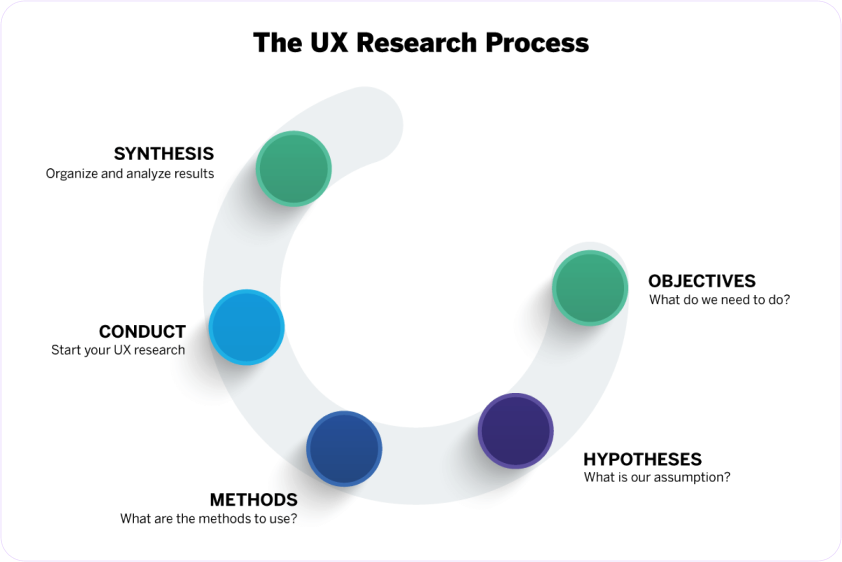
The 5 Stages of Expert Problem Discovery
This is the framework expert designers use to go from vague stakeholder requests to specific, validated problems ready for solution design. We’ll cover each stage briefly here (detailed guides linked at the end of each section).
Stage 1: Gather Context
Purpose: Understand the full picture before diving into solutions
Activities:
- Stakeholder interviews: What’s the business context? What prompted this request? What constraints exist? What does success look like from their perspective?
- Existing research review: What do we already know? What past research is relevant?
- Current state documentation: How does the current system/process work? What data already exists?
Time required: 2-3 days
Output: Context document with business goals, constraints, assumptions to test, existing knowledge
Common mistake: Skipping this and jumping straight to user research. You need business context to ask users the right questions.
Pro tip: Create an assumption map. List everything stakeholders are assuming about users, problems, and solutions. These become your research questions.
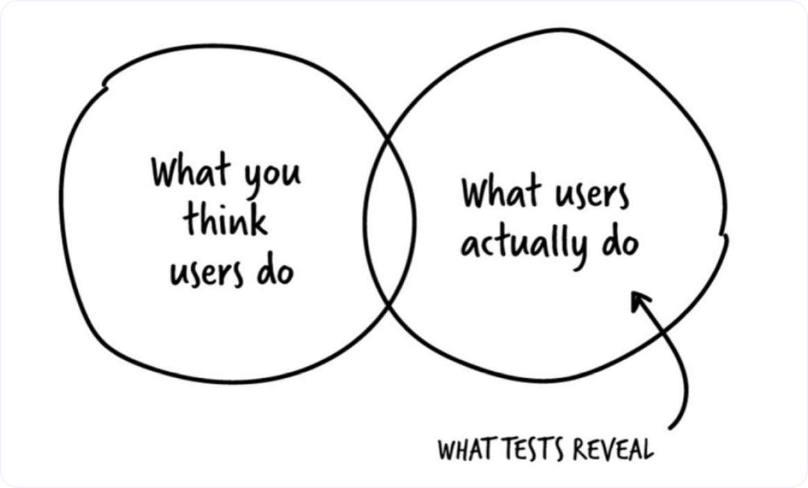
Stage 2: Understand Current State
Purpose: Deeply understand what users do now, not what they say they do or what you think they do
Activities:
- User interviews (5-10 users): Focus on behaviors, not opinions. Ask about last time they did X, walk through their process, understand their workarounds
- Contextual inquiry: Watch users in their natural environment doing the actual tasks
- Analytics analysis: What does quantitative data show about current behavior patterns?
- Support ticket review: What problems are users reporting? What questions do they ask?
Time required: 1-2 weeks
Output: Current state journey maps, behavioral patterns, pain points (with evidence), workarounds users have created
Common mistake: Asking users what they want (opinions) instead of understanding what they do (behavior). “What would you like?” gets aspirational answers. “Walk me through last time you did X” gets truth.
Pro tip: Pay special attention to workarounds. When users create elaborate Excel spreadsheets alongside your software, or keep post-it notes on their monitor, they’re telling you where your solution fails.
Stage 3: Explore User Context
Purpose: Understand not just what users do, but why they do it, in what contexts, and what deeper needs drive behavior
Activities:
- Deep dive interviews: Use 5 Whys technique, Jobs-to-be-Done framework
- User segmentation: Identify meaningful differences between user groups
- Mental model mapping: How do users think about this domain? What concepts and relationships exist in their minds?
- Trigger and barrier analysis: What prompts action? What prevents it?
Time required: 1 week
Output: User segments with distinct needs, mental models, motivations and barriers, opportunity areas
Common mistake: Staying surface level. “Users are frustrated with the interface” isn’t deep enough. Why frustrated? What specifically? What underlying need isn’t being met?
Pro tip: When a user says something is “confusing” or “frustrating,” that’s the start of inquiry, not the answer. Keep digging. What specifically is confusing? Can you show me? What did you expect? What did you need to accomplish?
Stage 4: Frame the Problem
Purpose: Translate messy research findings into a clear, specific problem statement that guides solution design
Activities:
- Pattern synthesis: Look across all research for recurring themes
- Root cause analysis: Distinguish symptoms from causes
- Problem statement drafting: Use the 6-component framework (specific user segment, observable problem, context, quantified impact, validated root cause, evidence)
- Validation review: Check problem statement against research data
Time required: 2-3 days
Output: Validated problem statement(s), prioritized by user and business impact
Common mistake: Writing problem statements that are actually solution statements in disguise. “Users need a better dashboard” is a solution. “Account managers spend 2+ hours manually aggregating data because the system doesn’t integrate their tools” is a problem.
Pro tip: A good problem statement makes obvious what to design. A bad one leaves you guessing. If your problem statement could lead to 10 different design directions, it’s not specific enough.
Deep dive: Read our complete guide to problem framing in UX for templates and examples.
Stage 5: Validate & Refine
Purpose: Ensure your problem understanding is correct before committing to solution design
Activities:
- Problem validation with users: “Here’s what we think the problem is…” Does this match their experience?
- Stakeholder alignment: Do stakeholders agree this is the right problem to solve? Do they understand why?
- Prioritization: If multiple problems discovered, which to solve first?
- Success criteria definition: How will we know if we’ve solved this?
Time required: 2-3 days
Output: Validated, stakeholder-aligned problem statement with defined success metrics
Common mistake: Assuming your problem framing is correct without validating it. Even expert researchers misunderstand sometimes. Quick validation prevents big mistakes.
Pro tip: Present your problem statement to 2-3 users who weren’t in your research. If they immediately say “yes, exactly!” you’ve nailed it. If they seem confused or say “kind of, but…” you need to refine.
The Full Process Timeline
Total time for thorough problem discovery: 3-5 weeks depending on complexity
Breakdown:
- Stage 1 (Context): 2-3 days
- Stage 2 (Current State): 1-2 weeks
- Stage 3 (User Context): 1 week
- Stage 4 (Framing): 2-3 days
- Stage 5 (Validation): 2-3 days
Can this be faster? Yes, if you have existing research to build on, fewer stakeholders, simpler problem space. The minimum viable discovery is 1 week: 3 days research, 2 days synthesis and framing.
Should it be longer? For complex enterprise products with multiple user types and high stakes, absolutely. Some discovery projects take 2-3 months. The key is matching research depth to decision risk.
Stakeholder to Problem Translation Challenge
One of the hardest skills in UX is translating what stakeholders ask for into what users actually need. Stakeholders almost always come with solution requests, not problem statements.
The Translation Framework
When a stakeholder says: “We need to add [feature/change]”
Your job is to translate backward to: “What user problem will this solve?”
Step 1: Understand the request Don’t just nod and design. Ask questions:
- What prompted this request?
- What problem are you trying to solve?
- What user behavior or feedback led to this?
- What does success look like?
Step 2: Identify assumptions Every solution request contains assumptions:
- Assumptions about users (who they are, what they need)
- Assumptions about problems (what’s broken, why it’s broken)
- Assumptions about solutions (what will fix it)
Document these. They become your research questions.
Step 3: Reframe as user problems Take the solution request and work backward:
Solution request: “Add a dashboard with 20 metrics”
Possible user problems:
- Users can’t find the metrics they need
- Users don’t know if they’re performing well
- Users spend too much time in multiple tools
- Users need to report to their managers
Step 4: Validate which problem is real Don’t assume. Research with actual users:
- Do they actually have this problem?
- How do they currently handle it?
- What workarounds have they created?
- Is this problem high-priority for them?
Common Stakeholder Request Patterns
Pattern 1: “Make it like [competitor]” Translation needed: Users don’t necessarily want your product to be like competitor. Understand what job competitor does well, then solve that job in your unique way.
Research question: What is it about competitor’s approach that works for users?
Pattern 2: “Users are asking for [feature]” Translation needed: Users ask for solutions, not problems. A user asking for “dark mode” might actually need “reduce eye strain during long sessions.”
Research question: What problem are users trying to solve when they request this?
Pattern 3: “Improve the UX” Translation needed: “UX” isn’t specific. This usually means “I don’t like it” or “users are complaining.”
Research question: What specific user behaviors indicate a problem? Where exactly are they struggling?
Pattern 4: “Increase [metric]” Translation needed: Metrics are symptoms. Understanding why the metric is low requires understanding user behavior.
Research question: What user problems or barriers are preventing this metric from being higher?
How to Present Problem Translations to Stakeholders
You’ve done research. You discovered the real problem is different from what stakeholders thought. How do you communicate this without seeming confrontational?
Framework:
- Validate their concern: “You were right that users are struggling with X”
- Present research findings: “Here’s what we learned from 10 users…”
- Connect to their goal: “This still achieves your goal of [business outcome], but here’s what actually needs to change…”
- Show the data: Use quotes, analytics, videos to make research findings tangible
- Recommend direction: “Based on this, I recommend we focus on Y instead of Z”
Example:
“You were absolutely right that the checkout needs improvement. Our 23% abandonment rate is concerning.
I interviewed 10 users who abandoned checkout and analyzed session recordings. What I discovered: users aren’t abandoning because the interface is confusing. They’re abandoning because shipping costs appear too late. In 8 out of 10 interviews, users said they would have completed purchase if they’d known shipping cost earlier.
This still achieves your goal of reducing abandonment and increasing revenue. But instead of redesigning the entire checkout interface, we should focus on displaying shipping estimates earlier in the flow, probably on the cart page.
Here’s the data…” [show quotes, recordings, analytics]
This works because:
- You validated their concern (abandonment is real)
- You showed research evidence (not opinions)
- You connected to their goal (still solving abandonment)
- You explained why your recommendation is better (informed by users)
For more on getting stakeholder buy-in for research, read our complete guide to stakeholder alignment.
Research Methods Overview
There are dozens of UX research methods. You don’t need to master all of them. You need to understand which to use when, and how to get good insights from each.
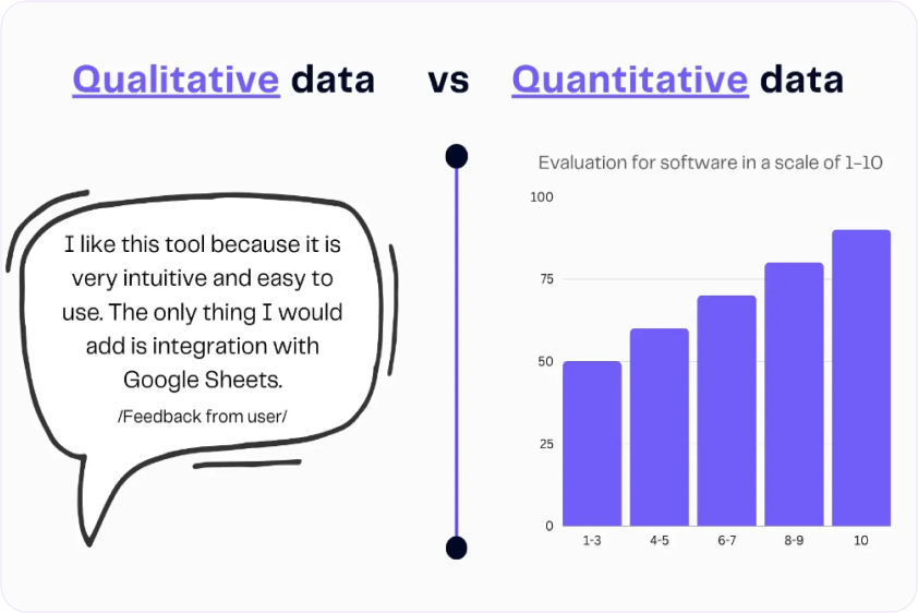
The Two Categories: Qualitative and Quantitative
Qualitative research answers “why” and “how”
- Small sample sizes (5-10 users)
- Deep understanding
- Uncovers problems you didn’t know existed
- Methods: Interviews, usability tests, field studies
Quantitative research answers “what” and “how many”
- Large sample sizes (100+ users)
- Statistical confidence
- Validates hypotheses
- Methods: Surveys, A/B tests, analytics
You need both. Qualitative helps you discover and understand problems. Quantitative helps you measure and validate solutions.
When to Use Each Method
User Interviews (Qualitative)
- Best for: Understanding motivations, exploring problem space, early discovery
- Sample size: 5-10 users
- Time required: 1-2 weeks
- Use when: You need to understand “why” users behave a certain way, you’re exploring new territory, you want detailed context
Usability Testing (Qualitative)
- Best for: Finding usability issues, validating designs, understanding mental models
- Sample size: 5-8 users per test
- Time required: 1 week
- Use when: You have something to test (prototype or live product), you want to see where users struggle, you need to compare design alternatives
Surveys (Quantitative)
- Best for: Validating findings at scale, measuring satisfaction, understanding priorities
- Sample size: 100+ for statistical significance
- Time required: 3-5 days
- Use when: You have specific questions to answer, you need quantitative validation, you want to measure sentiment across your user base
Analytics Review (Quantitative)
- Best for: Understanding what users do, finding drop-off points, baseline measurements
- Sample size: All users
- Time required: 2-4 hours
- Use when: You want to see actual behavior patterns, you need data to prioritize, you want to measure impact of changes
A/B Testing (Quantitative)
- Best for: Optimizing specific elements, choosing between options, measuring impact
- Sample size: Thousands (depends on traffic)
- Time required: 1-4 weeks until statistical significance
- Use when: You have two options and need data to decide, you want to measure impact precisely, you have enough traffic
Contextual Inquiry (Qualitative)
- Best for: Understanding real workflows, discovering workarounds, B2B research
- Sample size: 5-10 users
- Time required: 2-3 weeks
- Use when: Context matters a lot, you’re designing for complex workflows, you need to see the real environment
For detailed guides on each method, including scripts and templates, read our complete guide to UX research methodologies.
The Research Method Decision Tree
Start here: What’s your research question?
“Why do users do X?” → User interviews
“Can users complete task Y?” → Usability testing
“How many users experience problem Z?” → Survey or analytics
“Which design performs better?” → A/B test (if have traffic) or usability test (if don’t)
“What’s the actual workflow?” → Contextual inquiry
“What are current behavior patterns?” → Analytics review
“How should we organize content?” → Card sorting
Remember: Combine methods for comprehensive understanding. Interviews alone miss scale. Analytics alone miss why. The best research uses multiple methods.
Components of Expert-Level Problem Statements
A problem statement is the bridge between research and design. Good problem statements make design direction obvious. Bad ones leave you guessing.
Most problem statements are too vague: “Users are frustrated with the checkout process.” That could mean anything. It doesn’t guide design.
Expert-level problem statements have six components:
Component 1: Specific User Segment
Not “users.” Not “people.” Specific humans in specific contexts.
Weak: “Users have trouble finding reports”
Strong: “Account managers in B2B SaaS companies managing 5-10 client accounts”
Why specificity matters: Different user segments have different needs. First-time users need different solutions than power users. Mobile users need different solutions than desktop users.
How to define segments:
- By behavior (frequency of use, tasks performed)
- By role (job title, responsibilities)
- By experience level (novice, intermediate, expert)
- By context (mobile, desktop, time-constrained)
Component 2: Observable Problem
Not interpretations. Not feelings. Specific behaviors you can see and measure.
Weak: “Users are confused by the interface”
Strong: “Users click the Save button 3-4 times because no confirmation appears, then abandon the form thinking it didn’t work”
Observable means:
- You can watch it happen
- You can count occurrences
- You can measure it
- Multiple observers would describe it the same way
Component 3: Context
When, where, and under what circumstances does this problem occur?
Weak: “Users can’t find reports”
Strong: “When preparing for Monday morning executive meetings, users can’t locate the previous week’s performance reports on Friday afternoons”
Context elements:
- Temporal (when this happens)
- Environmental (where, on what device)
- Situational (under what circumstances)
- Frequency (how often)
Component 4: Quantified Impact
Numbers. On users and on business.
User impact metrics:
- Time wasted (adds 15 minutes to daily workflow)
- Error rates (users make mistakes 40% of the time)
- Task abandonment (65% give up)
- Frustration (8/10 users complained)
Business impact metrics:
- Conversion impact (23% cart abandonment = $2.3M annual revenue loss)
- Support load (450 tickets per month)
- Productivity cost ($180K annually in wasted time)
- Churn risk (15% mention this in exit surveys)
Weak: “This frustrates users”
Strong: “Causes 23% cart abandonment ($2.3M annual revenue loss) and generates 450 support tickets monthly ($33,750 annual support cost)”
Component 5: Root Cause (Validated)
Not the first explanation you thought of. The actual reason, validated with evidence.
How to find root cause:
- Use 5 Whys technique
- Look for patterns across multiple users
- Test alternative explanations
- Validate with data
Weak (assumed): “Button is hard to find”
Strong (validated): “Users expect payment step at end of checkout based on mental models from other e-commerce sites, but our flow puts it at beginning, causing confusion about where they are in the process”
Root cause is what you need to address in your solution. Symptoms can be fixed superficially, but problems recur. Root causes, when addressed, solve the problem completely.
Component 6: Evidence
What proves this problem is real and correctly understood?
Types of evidence:
- User quotes (from multiple users showing pattern)
- Analytics data (quantitative proof)
- Session recordings (visual proof)
- Support tickets (volume and themes)
- Usability test results (observed behavior)
Weak: “I think users want this”
Strong: “8 out of 10 users interviewed mentioned this, support system shows 234 related tickets in past quarter, analytics show 67% of users abandon at this step”
The Complete Formula
Put it together:
[Specific user segment]
experiences [observable problem]
when [context]
causing [quantified impact: user + business]
because [validated root cause]
evidenced by [data sources]
Real Example
Weak problem statement: “Checkout is confusing and needs improvement”
Expert-level problem statement: “Mobile shoppers ages 25-40 purchasing items over $50 abandon their cart at the payment step (34% abandonment rate, $1.2M annual revenue loss) when unexpected shipping costs appear because the cart page doesn’t display shipping estimates, violating user expectations from other e-commerce sites. Evidenced by 15 user interviews, heatmap analysis showing immediate exit after shipping reveal, and 89 support tickets asking about shipping costs before purchase.”
See the difference? The weak statement gives you no direction. The expert statement makes the solution obvious: display shipping estimates on cart page.
For templates, worksheets, and real examples, read our step-by-step guide to problem framing in UX.
Good vs Bad Problem Framing: Examples
Let’s look at real examples to see the difference between surface-level and expert-level problem framing.
Example 1: E-Commerce Checkout
Bad framing: “Checkout is confusing”
Why it’s bad:
- Not specific about who or what
- No observable behavior
- No impact quantification
- No root cause
- Can’t guide design
Good framing: “First-time mobile shoppers ages 25-40 abandon cart at payment step (34% rate, $1.2M annual loss) because shipping costs appear unexpectedly late in checkout flow, violating expectations set by cart page. 15 user tests showed consistent surprise and abandonment when shipping revealed. Heatmaps confirm immediate exit after shipping calculation.”
Why it’s good:
- Specific user segment
- Observable behavior (abandon at specific step)
- Quantified impact (34%, $1.2M)
- Validated root cause (unexpected costs)
- Multiple evidence sources
Solution becomes obvious: Show shipping estimates earlier, probably on cart page.
Example 2: B2B Dashboard
Bad framing: “Dashboard needs better UI”
Why it’s bad:
- “Better” is subjective
- No user behavior described
- No business impact
- “UI” is solution thinking
- What needs to be better? Why?
Good framing: “Sales managers preparing for Monday team meetings spend 45 minutes manually exporting and combining data from three dashboard views (should take 5 minutes) because the dashboard doesn’t allow sorting or filtering by team member performance. 22 out of 25 managers interviewed report this weekly frustration. Support logs show 156 requests for ‘exportable team performance view’ in past quarter.”
Why it’s good:
- Specific users and context
- Observable behavior (exporting, combining)
- Time impact quantified (45 vs 5 min)
- Root cause identified (can’t sort/filter)
- Evidence from interviews and support
Solution becomes obvious: Add sorting and filtering by team member, possibly with saved views.
Example 3: Mobile App Onboarding
Bad framing: “Users don’t complete onboarding”
Why it’s bad:
- Which users?
- Where in onboarding?
- Why not?
- No impact stated
- Could be dozens of reasons
Good framing: “First-time app users installing for a specific task (based on ad click) abandon at step 3 of 5-step onboarding (68% drop-off) before reaching the feature they came for. Usability tests with 12 users showed confusion about value proposition, users questioning why permissions were needed before understanding app benefits. 8 of 12 said they would have continued if they understood what they’d be able to do after onboarding.”
Why it’s good:
- Specific user intent (came for task)
- Exact drop-off point (step 3 of 5)
- Quantified (68%)
- Root cause (don’t understand value yet)
- Evidence from usability tests
Solution becomes obvious: Reorder onboarding to show value before asking permissions, or explain why permissions connect to user’s goal.
The Pattern
Notice what expert-level problem statements have in common:
- You can picture the specific user
- You can see exactly what’s happening
- You know why it matters (impact)
- You understand the real reason (root cause)
- You trust it’s real (evidence)
- The solution direction is clear
If your problem statement doesn’t do these things, it needs more specificity.
Bias Detection & Assumption Validation
Every designer brings biases to their work. Expertise creates biases. Past projects create biases. Your own preferences create biases. The question isn’t whether you have biases, but whether you catch them before they waste everyone’s time.
Common Biases in Problem Discovery
Confirmation bias: Seeing what you expect to see
You think users struggle with navigation, so you notice every navigation-related comment and miss comments about other problems.
Solution bias: Falling in love with your solution before understanding the problem
You have a clever interaction idea, so you frame the problem in a way that makes your solution seem perfect.
Recency bias: Over-weighting recent information
Last week, a user complained about color contrast. Now you think color contrast is the main problem, ignoring 20 other users who never mentioned it.
Expert bias: Assuming your knowledge equals user understanding
You understand how the system works, so you can’t imagine why users find it confusing.
False consensus bias: Assuming others think like you
You prefer keyboard shortcuts, so you assume all users want more keyboard shortcuts.
How to Detect Your Own Biases
Technique 1: The Assumption Audit
Before research, list everything you believe:
- Who the users are
- What problems they have
- Why they have those problems
- What they want
- What will solve it
Mark each as:
- High confidence (have data)
- Medium confidence (educated guess)
- Low confidence (complete assumption)
Everything medium or low requires validation.
Technique 2: Seek Disconfirming Evidence
Actively look for evidence that contradicts your hypothesis.
If you think problem is X, specifically ask: “What evidence would show problem is actually Y instead?”
Interview users who don’t fit your expected pattern.
Technique 3: Multiple Perspectives
Don’t synthesize research alone. Review findings with:
- Another designer (catches different patterns)
- A developer (sees technical implications)
- A product manager (sees business implications)
Different perspectives catch different biases.
Technique 4: The “Stupid Question” Test
For every conclusion, ask: “What stupid question would a complete outsider ask about this?”
Often the “stupid” question reveals the assumption you’re not questioning.
Validating Assumptions Before They Bite You
Not all assumptions are equally risky. Prioritize which to validate.
High risk assumptions to validate:
- Assumptions about root cause (wrong cause = wrong solution)
- Assumptions about user segments (who you’re designing for)
- Assumptions about context (when/where used)
- Assumptions about business constraints (what’s possible)
Lower risk assumptions you might accept:
- Specific UI preferences
- Nice-to-have features
- Edge cases affecting <5% of users
Quick validation techniques:
For user behavior assumptions:
- Review 20-30 session recordings (2 hours, free)
- Check analytics for patterns (1 hour, free)
For user need assumptions:
- 5 quick interviews (1 week, cheap)
- Survey to existing users (3 days, free)
For technical assumptions:
- 30-minute conversation with developer
- 1-day technical spike
The time invested in validation is always less than the time wasted building based on wrong assumptions.
Common Research Challenges
Theory is easy. Practice is messy. Here are the challenges every designer faces and practical solutions that work in the real world.
Challenge 1: No Access to Users
Why this happens:
- B2B products with gatekeepers
- Enterprise customers who won’t allow research
- Legal/compliance restrictions
- Geographic barriers
Solutions:
Use proxy users (imperfect but better than nothing):
- Customer support teams (talk to users daily)
- Sales teams (hear user problems during demos)
- Internal employees in similar roles
- Former users or prospects
What you can learn from proxies: General patterns, common complaints, frequently asked questions
What you can’t learn: Specific workflows, nuanced motivations, observed behavior
Leverage indirect access:
- Support ticket analysis (what are users asking about?)
- User reviews (App Store, G2, Trustpilot)
- Community forums (Reddit, Stack Overflow, niche communities)
- Social media listening
Build case for access gradually:
- Start with secondary research
- Show value of insights
- Request 30 minutes with one user as pilot
- Use success to justify more access
Real example: B2B designer couldn’t access enterprise IT administrators. Started by analyzing 6 months of support tickets, found patterns, created hypothesis. Presented findings to sales team, got permission to join one customer call as observer. Turned that into 5 customer interviews. Built credibility through incremental wins.
Challenge 2: Limited Time
The pressure: “We need designs by Friday, no time for research”
Solutions:
Rapid research methods (better than no research):
- Guerrilla testing (find users in public spaces)
- Remote unmoderated testing (users test async)
- Quick surveys (15 minutes to create, 2 days for results)
- Analytics sprint (4 hours of focused analysis)
Time-boxed research sprints:
- Day 1: Analytics review + existing research
- Day 2-3: 5 quick user interviews (30 min each)
- Day 4: Synthesis
- Day 5: Validation with stakeholders
Total: 1 week instead of 3, still dramatically better than no research
Continuous research (prevents time crunches):
- Interview 1 user per week always
- Ongoing analytics monitoring
- Regular support ticket review
- Build research repository over time
When research is continuous, you have insights ready when projects start.
Real example: Designer had 2 weeks to redesign checkout. Spent first 3 days on research: 2 days watching session recordings (found 3 major issues), 1 day doing 5 quick user tests on current checkout. Had clear direction by day 4, designed days 5-10, shipped tested solution in time.
Challenge 3: Limited Budget
The constraint: “$0 research budget”
Solutions:
Free tool stack:
- Video calls (Zoom free tier, Google Meet)
- Transcription (Otter.ai free tier, YouTube auto-transcribe)
- Surveys (Google Forms)
- Analytics (GA4 free)
- Session recordings (Hotjar free tier, Microsoft Clarity)
- Note-taking (Notion free, Google Docs)
Low-cost participant recruitment:
- Email existing users (free)
- Post in relevant communities (free)
- Use your network (free but limited)
- Customer support as recruiting source (free)
- Small incentives ($10-25 gift cards instead of $100)
Leverage existing resources:
- Customer support calls (ask to listen in)
- Sales demos (observe user reactions)
- Existing analytics (already paying for it)
- Internal users (for initial concept feedback)
Real example: Freelance designer with $0 budget recruited via LinkedIn (found 8 participants in target role), used Google Meet for interviews, Otter.ai for transcription, Notion for synthesis. Total cost: $80 in Amazon gift cards. Results: saved client from building wrong feature.
Challenge 4: Stakeholder Resistance
The objection: “We don’t need research, I know what users want”
Solutions:
Start with pilot project:
- Pick one small, low-risk project
- Do minimal research (1 week)
- Show clear impact on decisions
- Use success to justify more research
Frame in business terms:
- Not “better UX,” say “reduce support costs”
- Not “user-centered,” say “decrease churn”
- Show competitor research practices
- Present ROI data (this guide has examples)
Make research visible:
- Share user quotes in Slack
- Invite stakeholders to observe sessions
- Send weekly research insights
- Show how research changed direction (prevented mistakes)
Quick wins strategy:
- Find obvious issue through research
- Show how research caught it
- Quantify what was saved
- Build credibility gradually
Real example: Designer facing resistant PM did 1-week guerrilla research without asking permission. Found critical usability issue that would have caused major support load. Presented findings with video clips. PM saw value, approved 2 weeks for next project.
For complete guide on getting stakeholder buy-in, including pitch templates and objection responses, read our stakeholder alignment guide.
Getting Started: Your First Steps
You’ve read 4,000+ words about UX research and problem discovery. Knowledge without action is wasted. Here’s exactly what to do this week.
This Week: Your 5-Day Discovery Sprint
Monday (2 hours):
- Create assumption map for your current project
- List everything you’re assuming about users, problems, solutions
- Highlight 3 riskiest assumptions to validate
- Write research questions
Tuesday-Thursday (1 hour each day):
- Talk to 1 user per day (even 15-minute conversations help)
- Ask about their current workflow and pain points
- Focus on behavior, not opinions
- Take notes on patterns
Friday (2 hours):
- Review notes from 3 users
- Identify patterns (what did you hear multiple times?)
- Draft problem statement using 6-component framework
- Share with 1 stakeholder for alignment
Total time investment: 9 hours
What you’ll have by Friday:
- Validated (or invalidated) your assumptions
- Real user insights
- Problem statement ready for design
- Stakeholder alignment
Month 1: Build Research Habit
Week 1: Discovery sprint (above)
Week 2: Design based on research, test with 3 users
Week 3: Refine based on testing, validate solution solves problem
Week 4: Reflect on process, document what you learned
By end of month:
- One project completed with research
- Clear evidence of impact
- Process you can repeat
- Momentum for continuous research
Level Up: Resources to Explore
For problem framing mastery:
- Read our step-by-step guide to problem framing in UX
- Download problem statement template
- Review 10 real examples
For research methods:
- Read our complete guide to UX research methodologies
- Pick one method to master this quarter
- Find templates and scripts
For stakeholder buy-in:
- Read our guide to stakeholder alignment
- Use the pitch template for your next project
- Build case for research budget
For continuous learning:
- Join UX research communities (r/UXResearch on Reddit)
- Follow researchers on LinkedIn
- Share your own learnings
Conclusion
The most expensive mistake in product design isn’t bad visual design or clunky interactions. It’s solving the wrong problem beautifully.
UX research and problem discovery are your insurance against wasted effort. Two weeks of discovery prevents two months of design rework. $8,000 in research prevents $340,000 in wasted development. One user interview changes your entire approach.
The designers who move fastest long-term are the ones who slow down initially to understand problems correctly.
You don’t need perfect research. You need better research than you’re doing now. Start small:
- Interview 3 users before your next project
- Validate 1 assumption you’re making
- Write 1 problem statement using the framework
- Share 1 user quote with your team
Research isn’t extra work before the real work. Research is how you ensure the real work actually matters.
The question isn’t “do we have time for research?” The question is “can we afford to build the wrong thing?”
You now have the frameworks, processes, and confidence to discover the right problems before designing any solutions. Use them.
Related Guides:
- Problem Framing in UX: Step-by-Step Guide (Detailed problem statement templates)
- 7 Signs Your UX Research Is Too Surface-Level (Quality self-assessment)
- Common UX Research Challenges and Solutions (Practical workarounds for real constraints)
Start here: Pick one article above and read it this week. Then take one action from this guide. Build momentum through small wins.x
Have questions about UX research or problem discovery? Share this guide with us on our Meta Community and start the conversation.


 by ideoz