Why Color Matters in Product Design
When it comes to product design, color has the power to influence user perception and behavior. In fact, up to 85% of consumers cite color as a primary reason for why they choose a product. Color can evoke emotions, set the tone, and communicate key messages without a single word. For product designers, understanding how to leverage the psychology of color is critical for creating experiences that resonate on a deeper level.

The Psychology of Color: Understanding Emotions and Actions
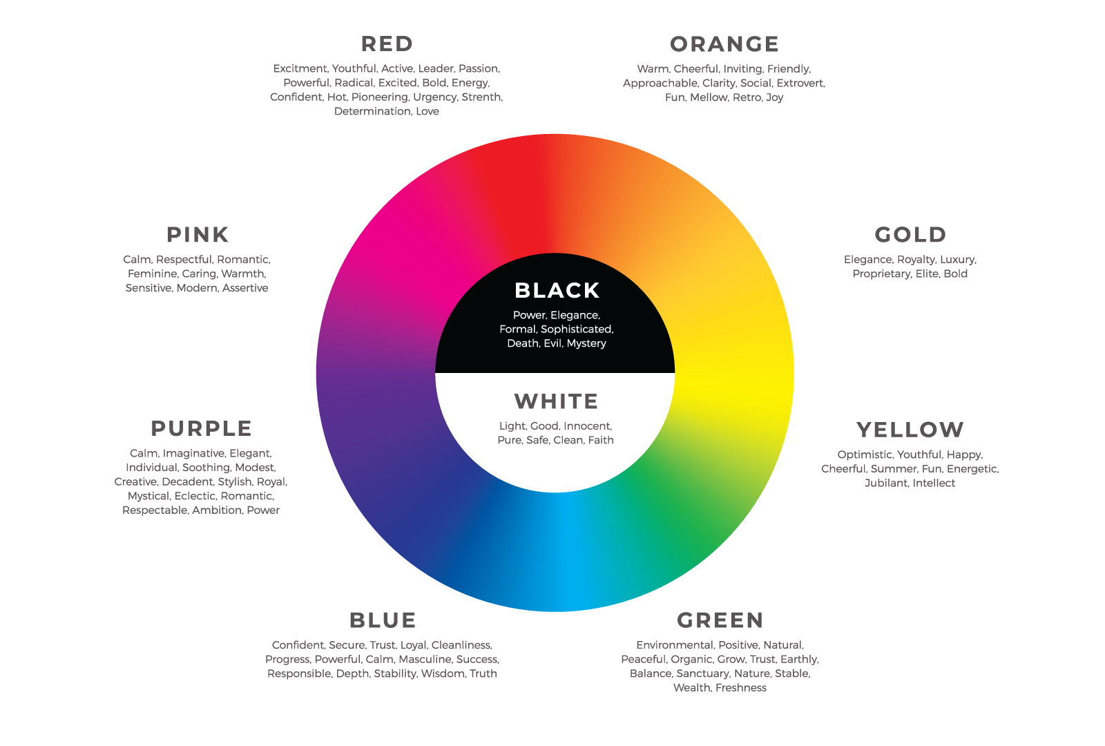
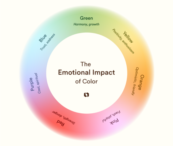
The first thing users notice about your product is its color. Colors set the mood and tone immediately, influencing users’ first impressions. Consider the emotional impact of different hues:
- Warm tones (Red, Orange, Yellow): Energetic and attention-grabbing – ideal for products that need to convey urgency or action.
- Cool tones (Blue, Green, Purple): Calming and trustworthy – perfect for products associated with health, finance, or technology.
- Neutrals (Gray, Black, White): Minimalist and sophisticated – great for high-end or sleek product lines.
By aligning the emotional impact of color with your product’s purpose, you can create designs that connect with users from the moment they engage.

Guiding User Interaction with Color
Color plays a critical role in user experience by guiding interactions. It can highlight important features, buttons, and actions. For example:
- Calls to Action (CTAs): Make sure your CTAs stand out by using bold, contrasting colors that draw attention.
- Error States: Using red for error messages or warnings is a universal convention, signaling urgency or caution.
- Success Messages: Green is often associated with success or completion, making it a popular choice for confirmation messages.
A well-designed product uses color intentionally to enhance user interactions, not overwhelm them.

Creating Visual Hierarchy with Color
Effective color use helps to establish a visual hierarchy, ensuring that users know where to look and what to focus on. By combining complementary colors and using variations in tone, you can create contrast and highlight key elements of the design. For instance:
- Accent Colors: Use these sparingly to draw attention to specific areas like primary buttons or important information.
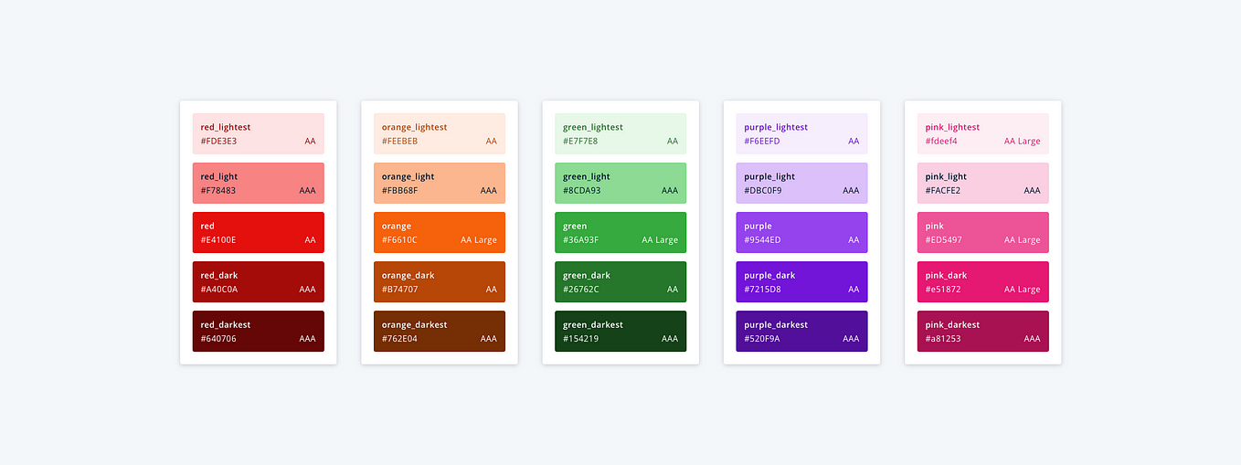
- Background and Text Colors: Ensure there is enough contrast between your background and text colors to make content legible and accessible to all users.
Mastering this balance will help users navigate your product intuitively.

Designing for Accessibility: Color for All Users
One of the most important aspects of using color in design is ensuring accessibility. Not all users perceive color the same way, so it’s essential to design with inclusivity in mind:
- Color Contrast: Ensure that text and background colors have enough contrast for readability.
- Colorblind-Friendly Palettes: Avoid relying solely on color to convey information. Use texture, icons, or patterns to distinguish elements for those with color vision deficiencies.
- Testing for Accessibility: There are various tools available to test the color accessibility of your design. This step ensures your product can be used by the widest possible audience.

Color and Branding: Building Identity Through Consistency
Color is a cornerstone of brand identity. Just think of the bright red of Coca-Cola or the iconic blue of Facebook. Consistency in color usage not only reinforces brand recognition but also helps solidify trust with users. In product design, this means using brand colors consistently across all touchpoints, from your UI elements to marketing materials. A cohesive color scheme builds familiarity and ensures your product feels like a natural extension of your brand.

Balancing Psychology, Usability, and Aesthetics
The best product designs strike a perfect balance between emotional impact, functionality, and visual appeal. By understanding the psychology of color and applying it effectively in your design choices, you can create products that not only look good but also feel good to use.
Whether you’re guiding user actions, creating a seamless hierarchy, or building brand identity, color is the unspoken language that makes it all possible. When used thoughtfully, it elevates the user experience, turning a functional product into something memorable and meaningful.
